Dashboards fail when they show everything and prioritise nothing. We rebuilt Yagankar's around one question: what is your next move?
For employers
Your home now leads with the numbers that need you: proposals to review on open postings, active engagements with a payment or wrap-up due, drafts waiting to be posted. Below that, the platform starts the next search before you do — the people you have hired (your bench) and suggested talent matched to each open role by the smart matcher. Posting, reviewing and re-hiring all start from one screen.
For talent
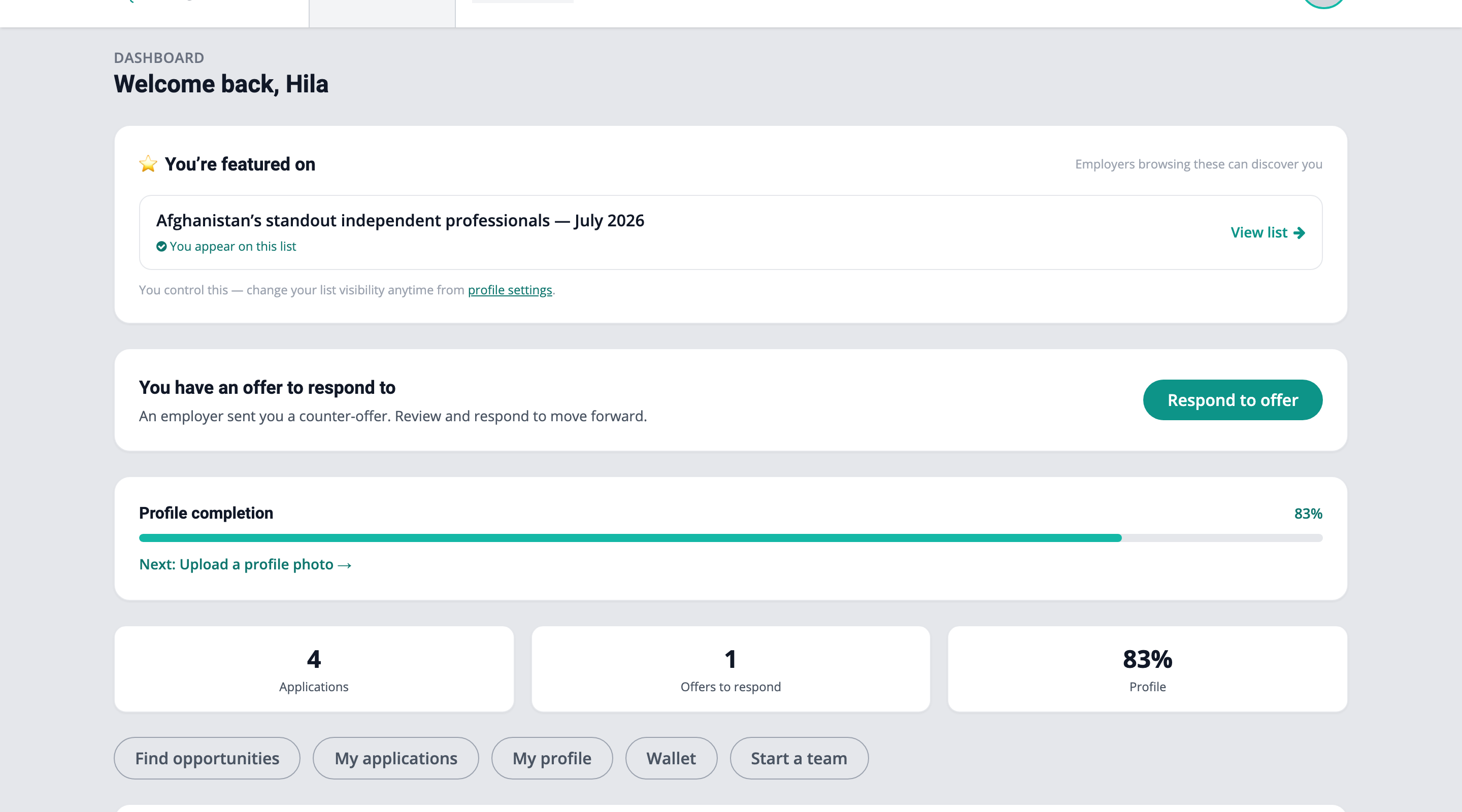
Freelancers land on their own version: applications and their statuses, offers waiting for a response (a pending counter-offer never hides), earnings at a glance, opportunities recommended from your actual skills — and a next step nudge that always knows the one thing most worth doing, whether that is uploading a certification or responding to an offer.
And the moments that matter
The dashboard is also where the platform's best news finds you: the "You've been selected to be featured" card when a curator picks you for a public list, a team invitation waiting for your consent, or word that someone you vouched for just landed their first paid hire.
Notifications got the same treatment — manageable, marked-read properly, and never louder than the work itself.